Bell Phillips
Visual Identity, Website & Brand Guidelines
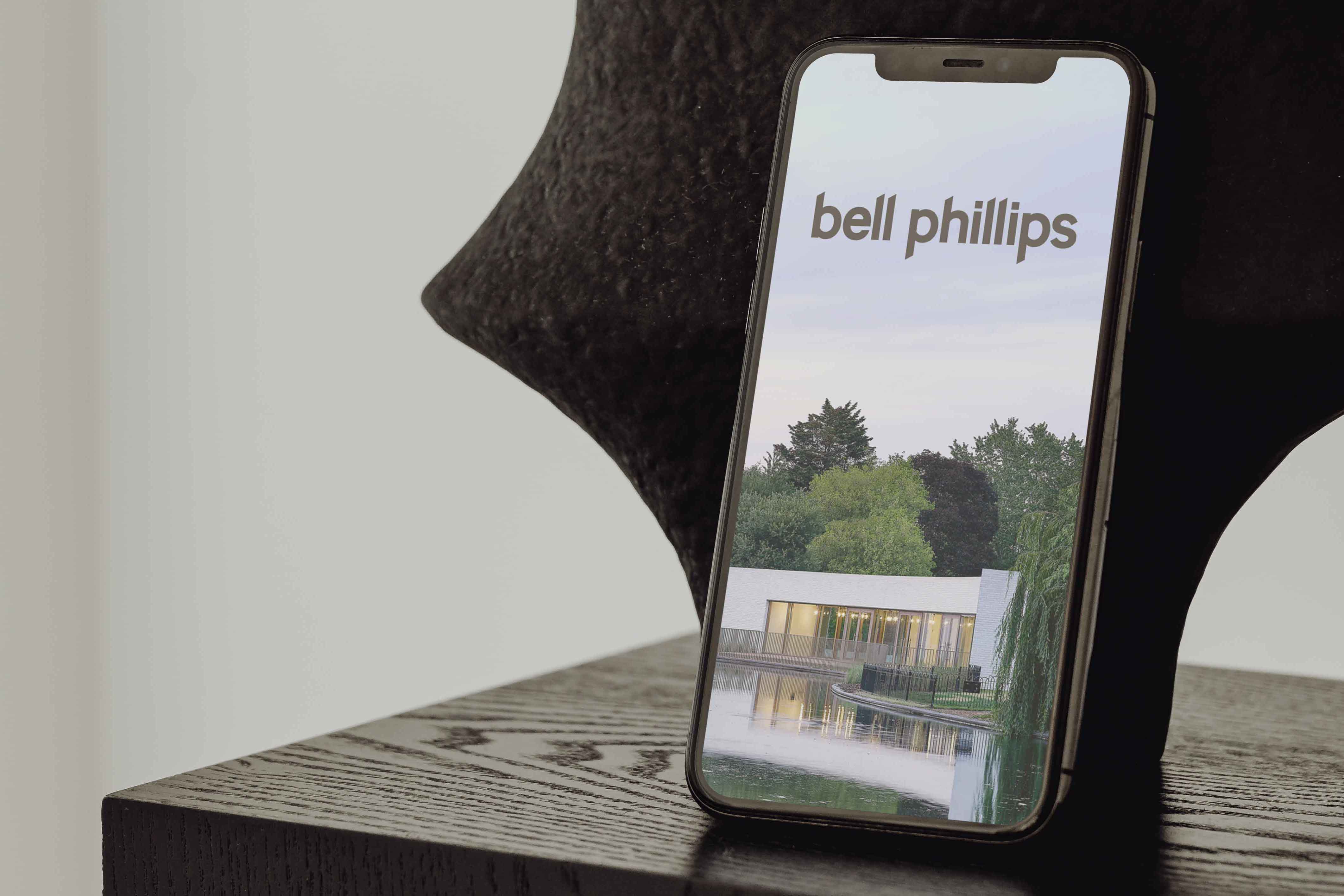
London-based architecture practice Bell Phillips commissioned a new visual identity, website and brand guidelines to better reflect their human-centred approach to housing design.


Business cards
Challenge
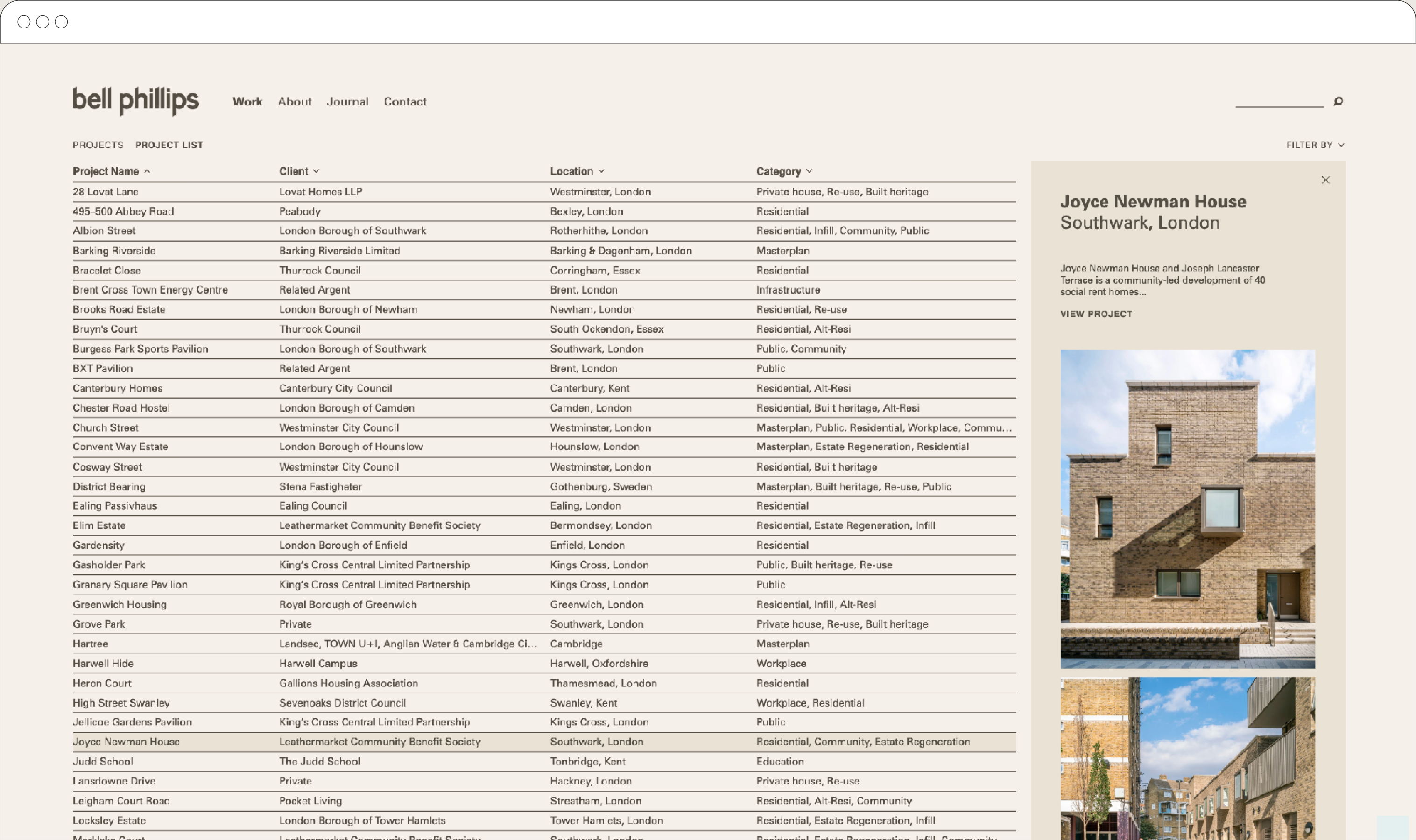
Bell Phillips had built a strong reputation in housing and community-focused design, but their brand and website didn't reflect the quality or humanity of the work. The existing identity lacked personality and failed to differentiate the practice. The website offered a poor user experience, and the team had no consistent templates to communicate the brand across documents and social media.



Solution
I started with an in-depth workshop to define Bell Phillips' core values, audience needs and visual aspirations, supplemented by competitor analysis and an external communications audit. The brief that emerged centred on human-centred design as the guiding theme, reflecting the practice's approach to sustainable housing and community-focused projects.
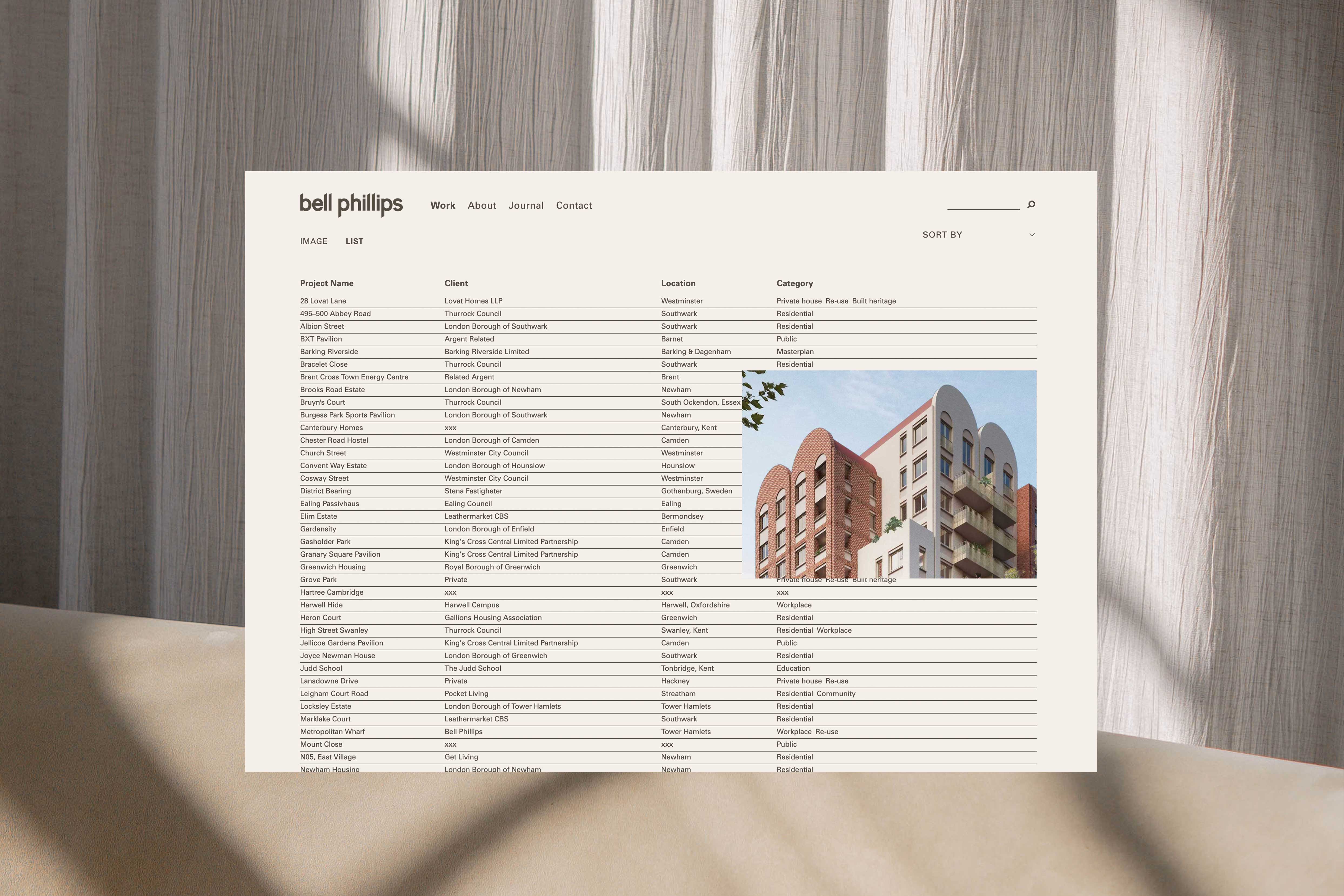
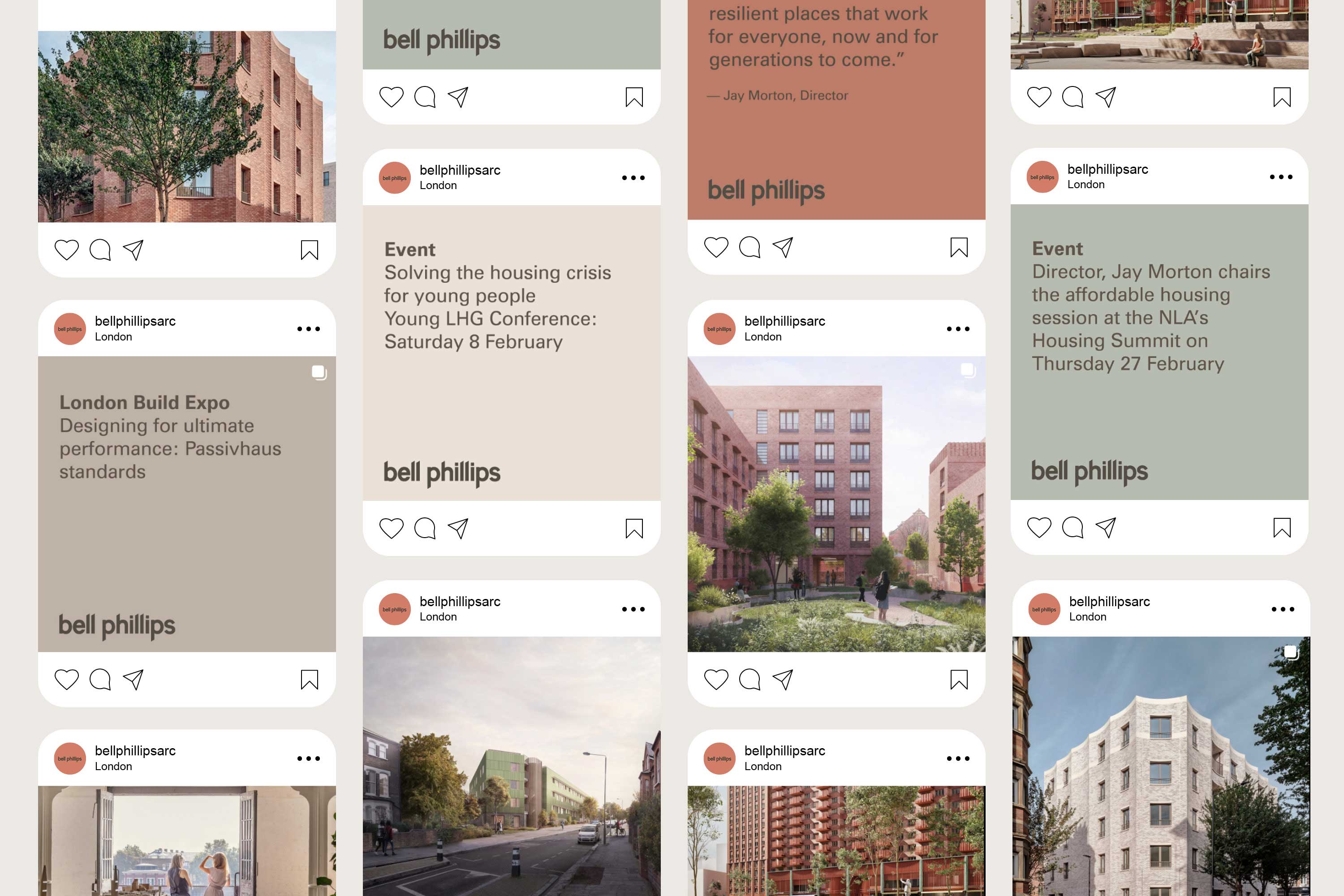
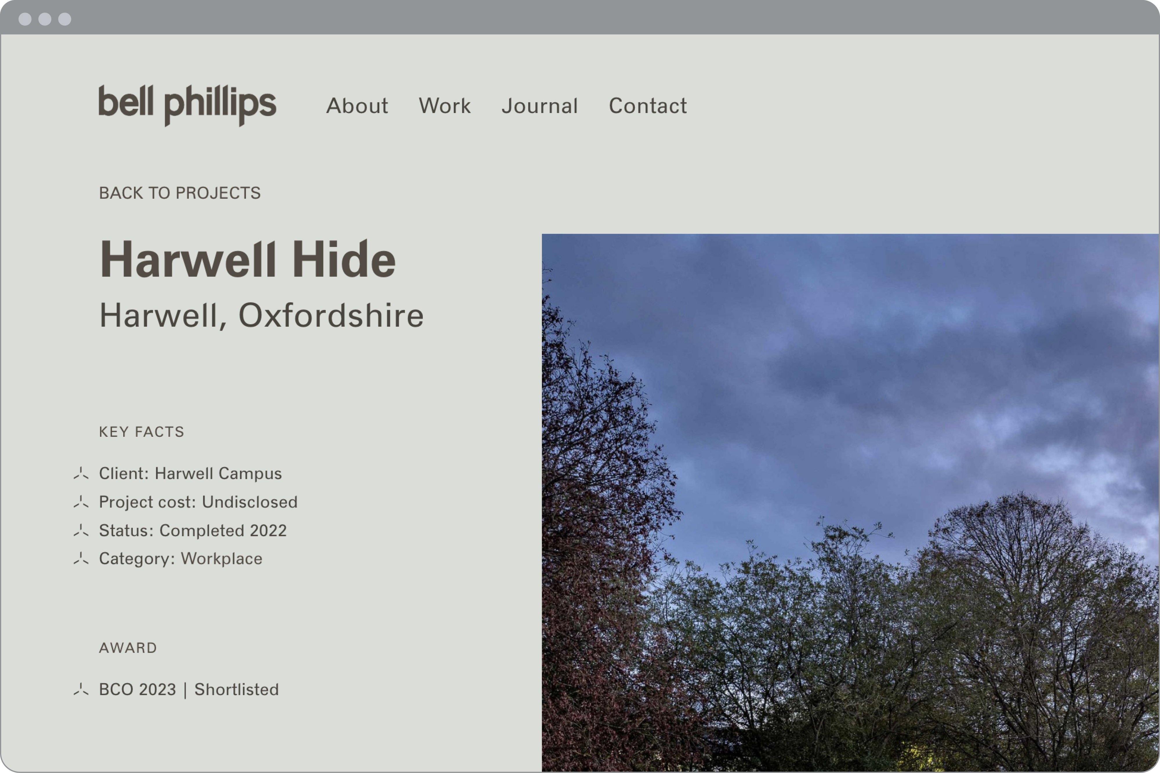
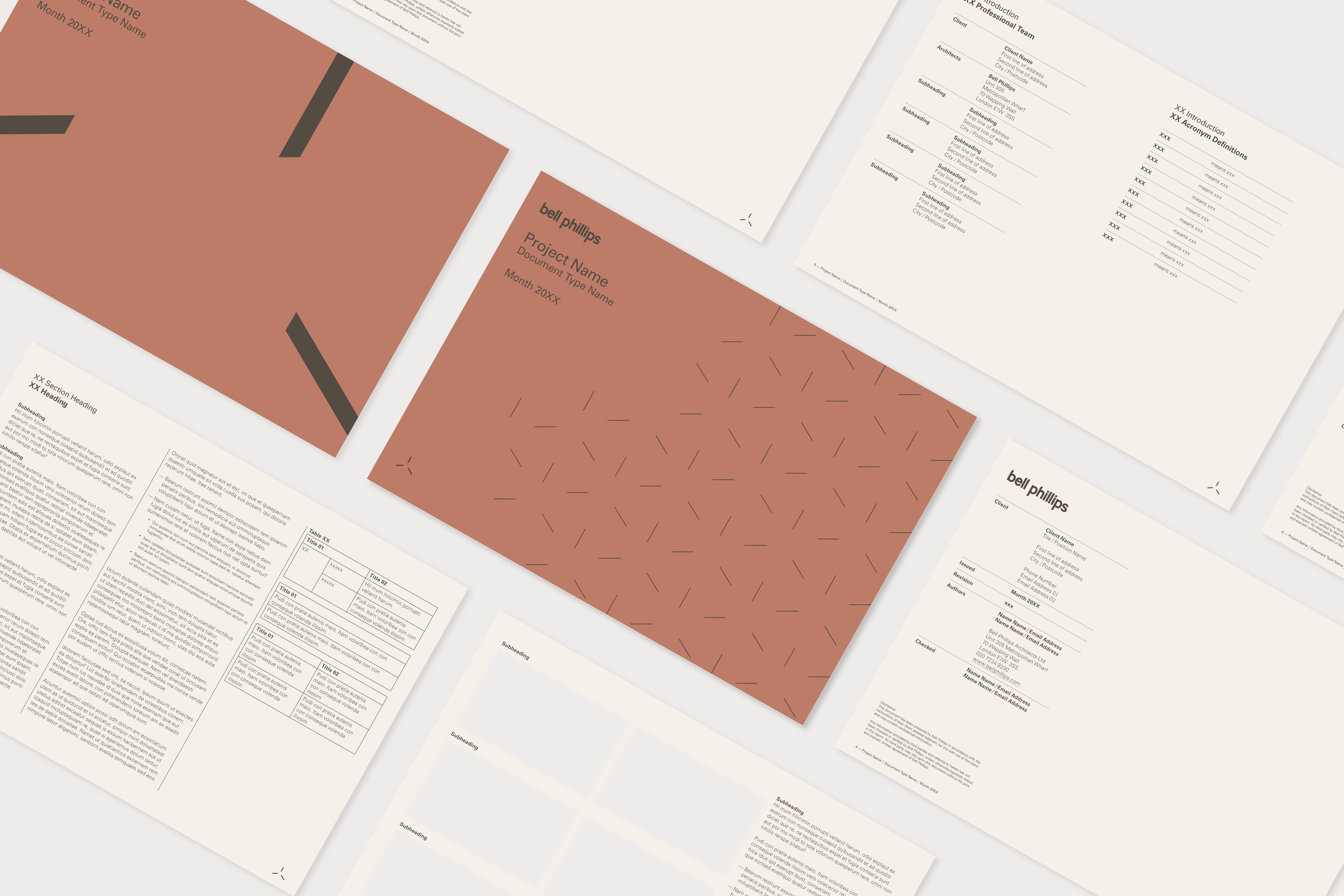
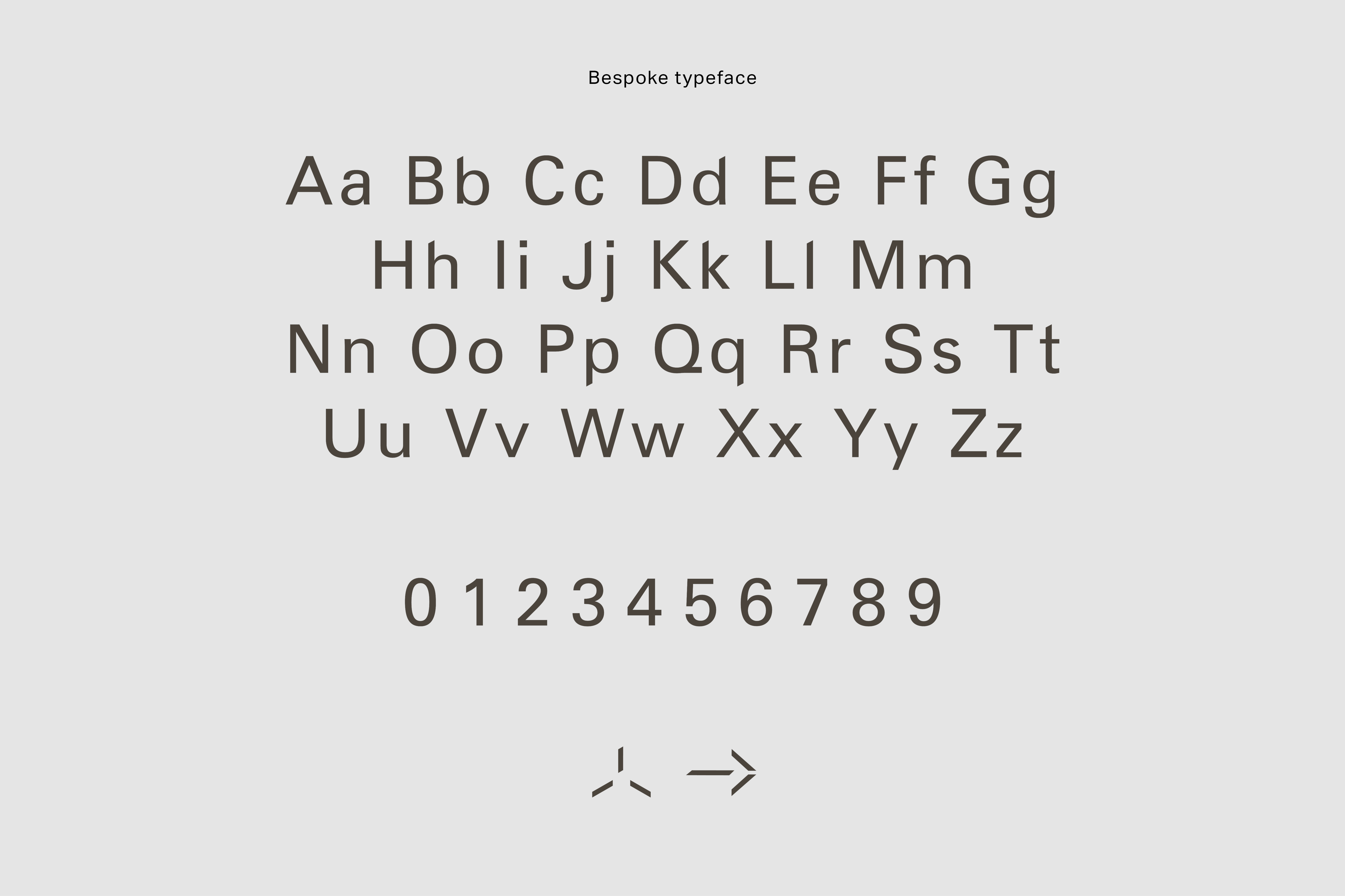
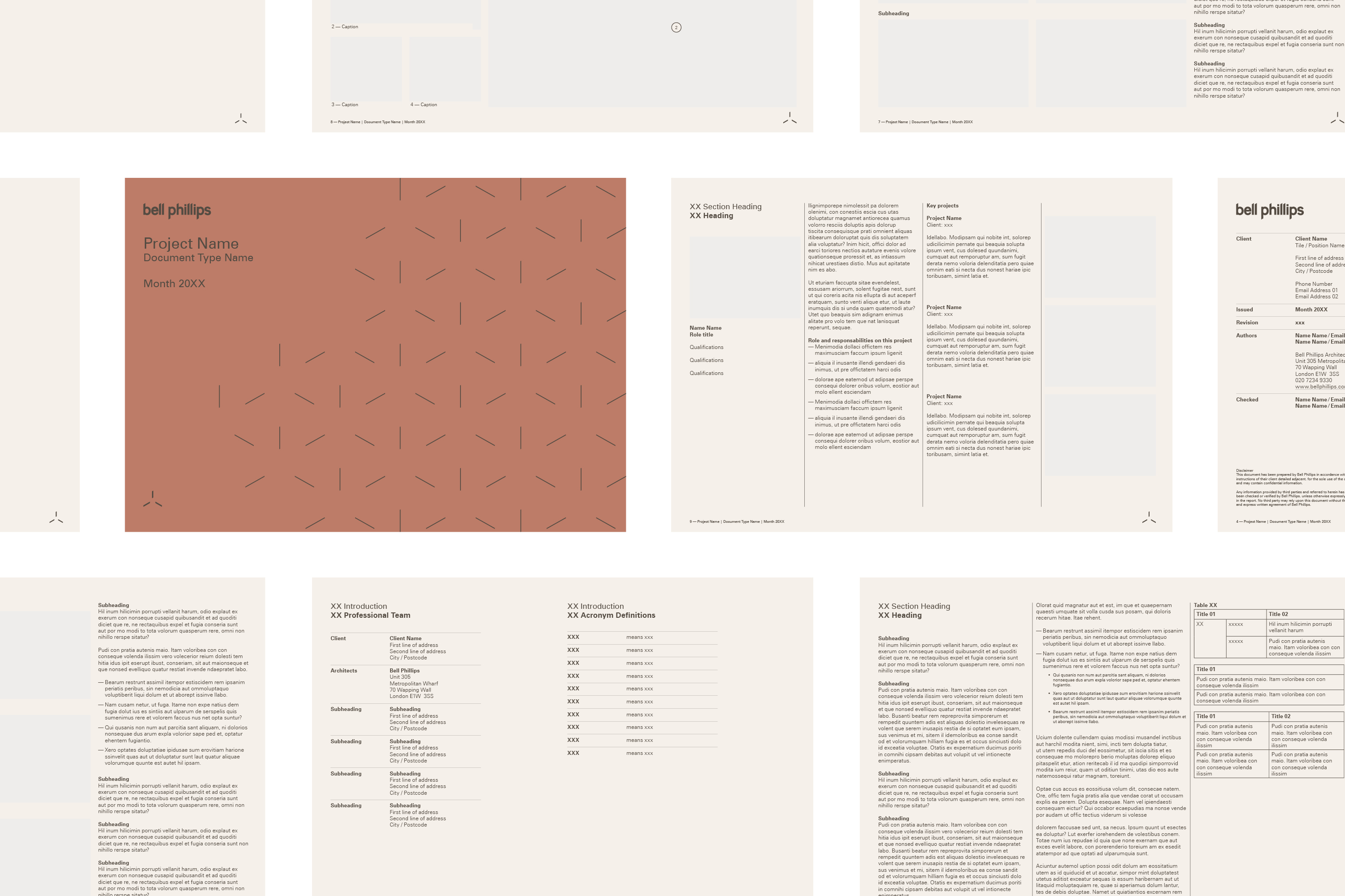
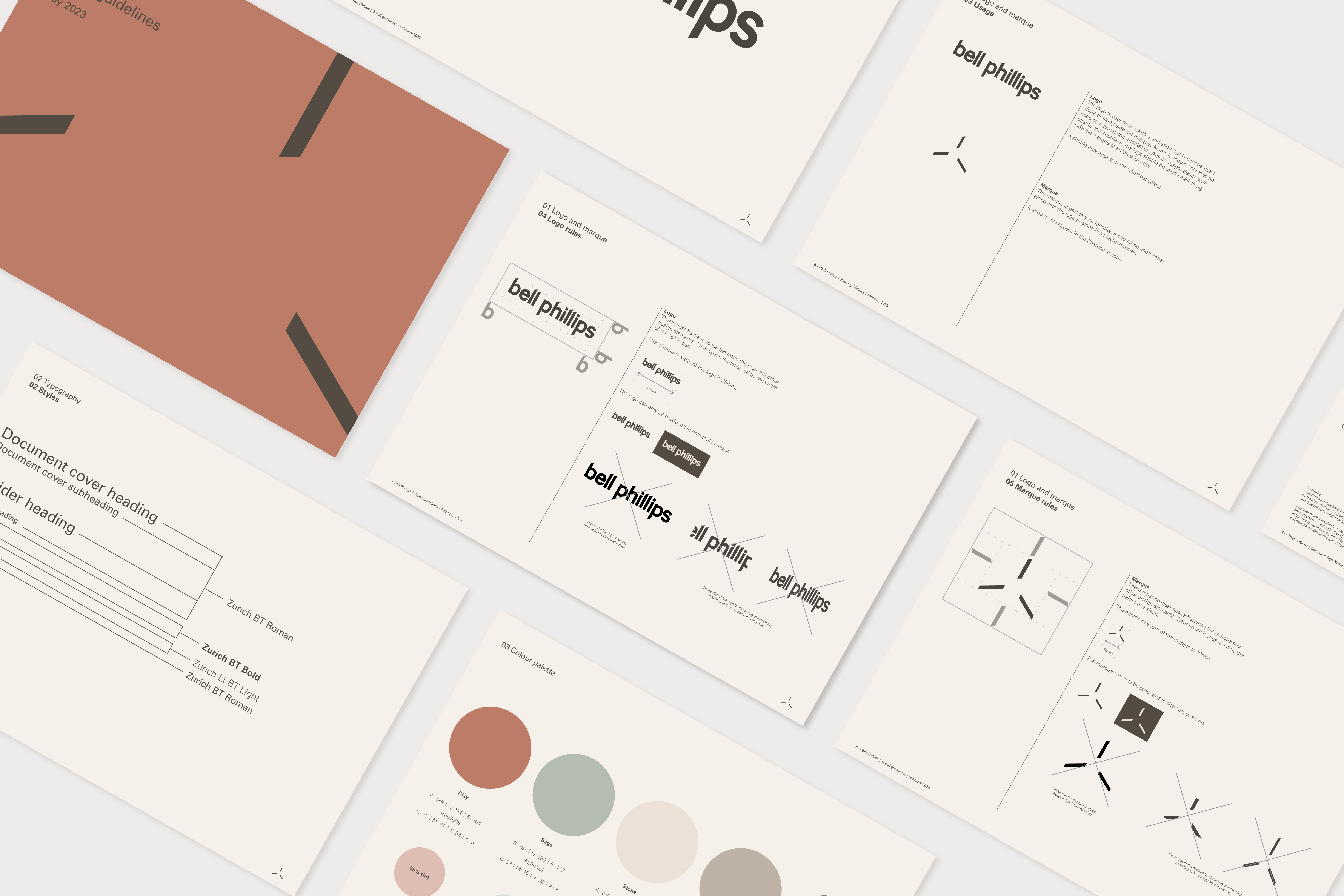
From this foundation I developed a warm colour palette drawn from the materials used in their projects, a redesigned logo and a bespoke typeface. The website was rebuilt around user-centric navigation with a visually rich project showcase. I also produced document templates for reports, proposals and social media assets, and branded layouts for LinkedIn and Instagram.
Results
The rebrand and website redesign produced a cohesive, distinctive online presence that gave Bell Phillips the tools to communicate their identity consistently across every touchpoint. The new site attracted more of the public sector clients and housing commissioners the practice wanted to reach, with measurable growth in traffic and engagement from launch.
Gallery

— Next Project
← Back to all work
Opstead
→